Onescape- one-stop shop for all the student needs
Onescape is a one-stop shop for all Arizona State University (ASU) students. From incoming freshmen who struggle to find housing, furniture, and home supplies within their budget, to seniors and graduating students who want to lease housing, and sell used items at a reasonable price.
It will be promoted as one of the must-have apps for all ASU students to find their needs instantly satisfied. By bypassing the confusing, intimidating, and price-hiking third-party services, and partnering with ASU, Onescape puts buyers and sellers directly in touch with each other for easy transactions.
The detailed project report can be accessed here.
Tools
Figma, Google Suite (Docs, Sheets, Forms), Zoom
Duration
3 months, 12 screens
E-commerce
Device
Desktop/Laptop- Website
Team Project
5 people
Challenge
Currently, students use WhatsApp, Facebook, OfferUp, etc. to get supplies and the information they need with a level of uncertainty, unfamiliarity, noise, and lack of choice. This gets confusing and tedious really quickly.
My Role
I primarily focused on brainstorming solutions for issues identified in the low-fidelity prototype. Additionally, I designed one of the presentations and collaborated with a teammate to design and prototype the high-fidelity prototype.
Results
Onescape's platform has demonstrated notable efficiency in its key performance indicators, achieving a 40% reduction in search time for essential items like housing and furniture. Additionally, the platform maintained a 100% task completion rate during usability testing of its low-fidelity prototype, indicating strong operational performance.
However, the testing also highlighted areas for improvement, such as navigation and usability, particularly in the clarity of section labels and the functionality of filters. Despite these challenges, Onescape has actively incorporated user feedback into its development process, leading to a 15% increase in user satisfaction ratings.
This iterative approach underscores the platform’s commitment to continuous enhancement and responsiveness to user needs.
40%
Reduction in search time for essential items.
100%
100% task completion rate during prototype usability testing
15%
User satisfaction
Our Design Process
Defining the product by developing personas and performing task analysis.
Designing a low-fidelity prototype.
Performing usability tests on the low-fidelity prototype.
Designing a high-fidelity prototype to resolve issues found in the low-fidelity prototype.
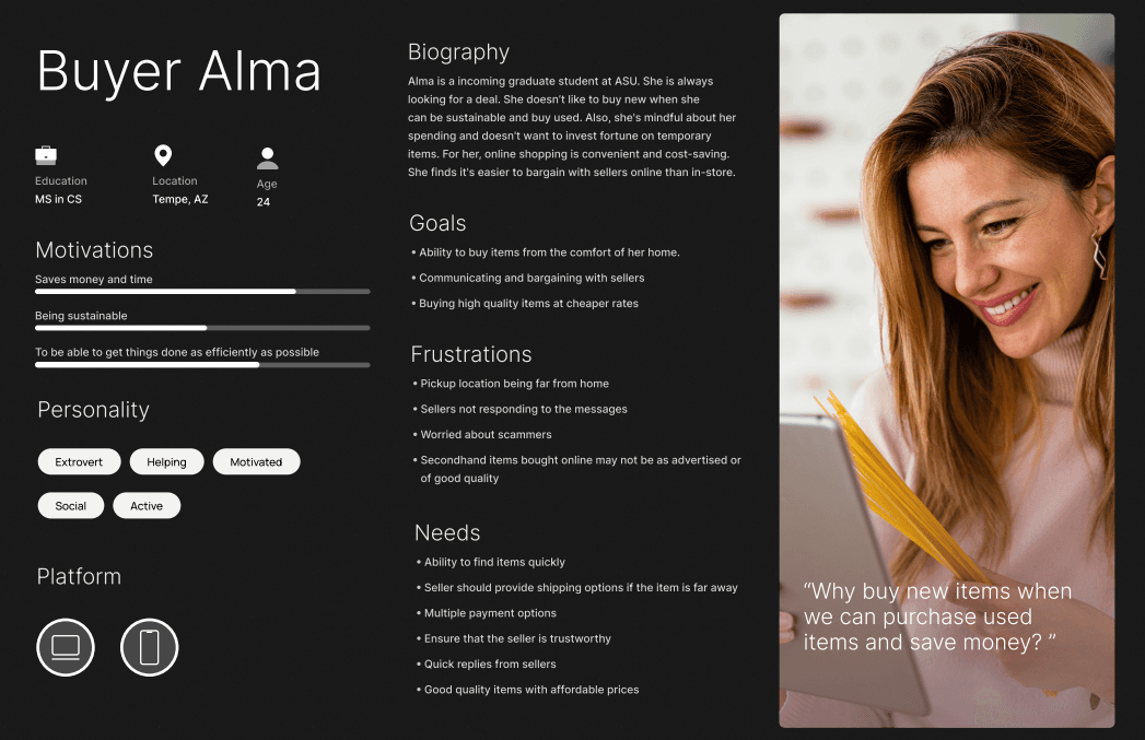
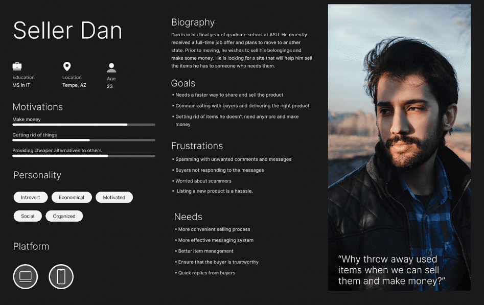
The Define Stage
We conducted a user survey and created two personas based on the needs, goals, and frustrations of users with similar platforms. The demographics we considered included -
ASU students,
Bachelor's, Master's, and Ph.D. students,
Age: 17- 40 approx.
International, out-of-state, and native students


Know more about the analysis
Designing the Low-Fidelity Prototype
We cross-referenced the survey responses, personas, and task flows for prioritizing features and designing the flows in the prototype.
Our objective was to get the basic features working and keep the interface as simple and intuitive as possible by utilizing existing design patterns, familiar iconography, and highly readable typography.


Testing the Prototype
We conducted a moderated usability test via Zoom to validate the designs of our low-fidelity prototype, its usability, and uncover any UX issues and breaks in the process.
Participants were all ASU graduate students with gender almost equally distributed between male and female, were aged between 18 and 34, were part of online marketplaces, and had experience with similar e-commerce sites.
Key Issues Identified
A few of the major issues identified during testing that caused significant confusion and frustration were -
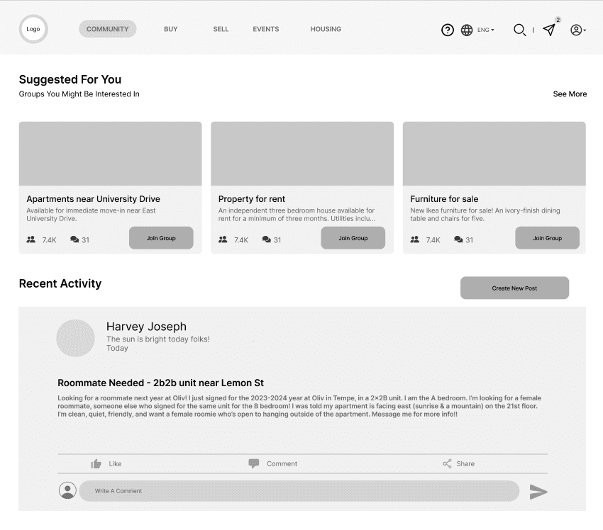
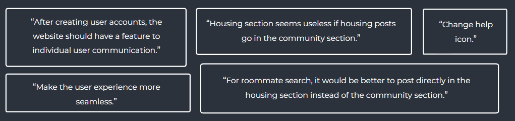
Community vs Housing Posts
Users found the terms housing and community confusing - they were more inclined to think that any posts related to looking for roommates or asking queries related to housing would be part of the Housing section instead of the intended Community one.
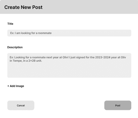
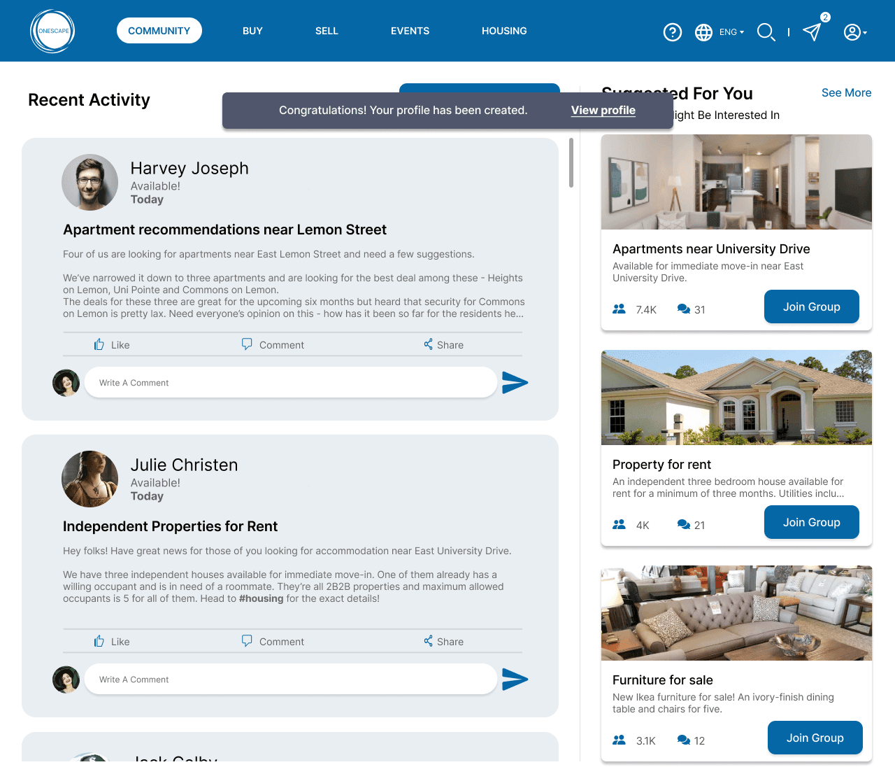
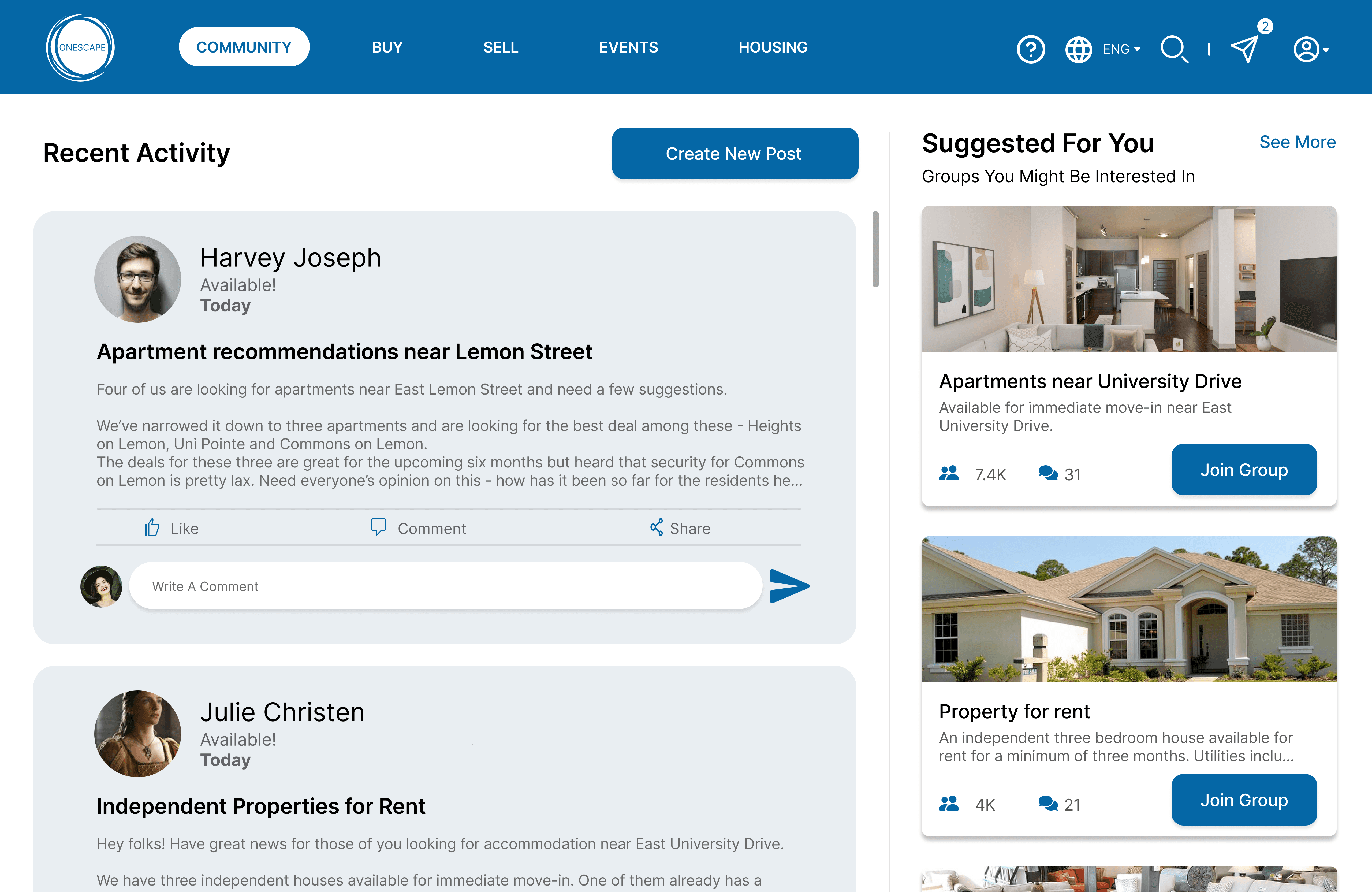
Issues in the Community Page
There were a few issues with the posts themselves too - the posts were too scattered distracting users, and the post feed view was limited. The “Create new post” CTA was not readily visible to a few users, they had to look around the page to find it.
Buy Filters
The majority of the users found the filters to be glitchy and had difficulties working with them to filter out products in the Buy section of the application.
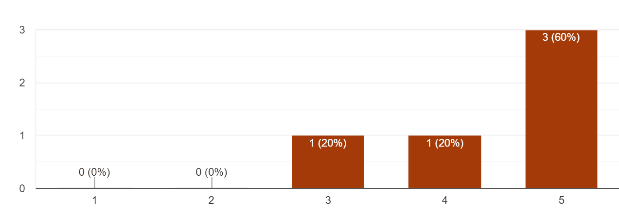
Overall, all the participants were moderately satisfied with the prototype.

Read more about testing process and results

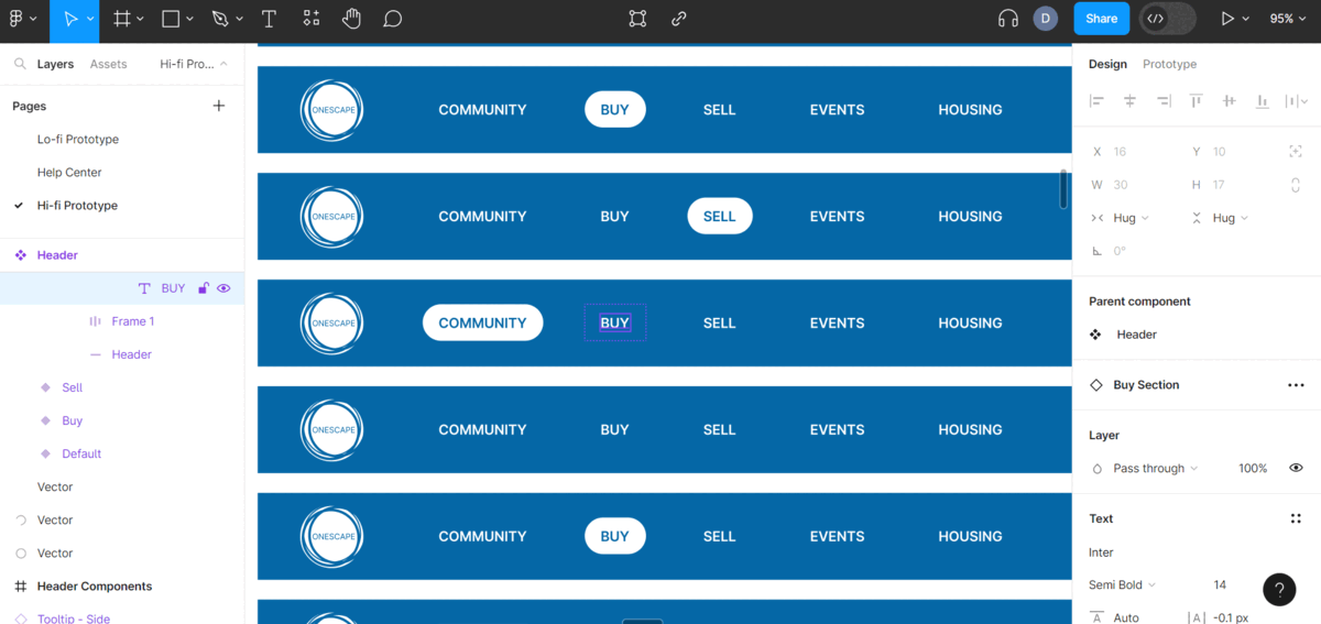
Designing the High-Fidelity Prototype
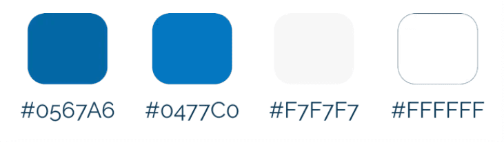
We started off by creating an identity for the product. We chose cool blue shades along with white and light grays for a visually appealing effect. We designed the logo and decided on button and icon designs for various states. As this product will be linked to ASU’s login portal, we designed the login page with ASU’s color palette in mind.


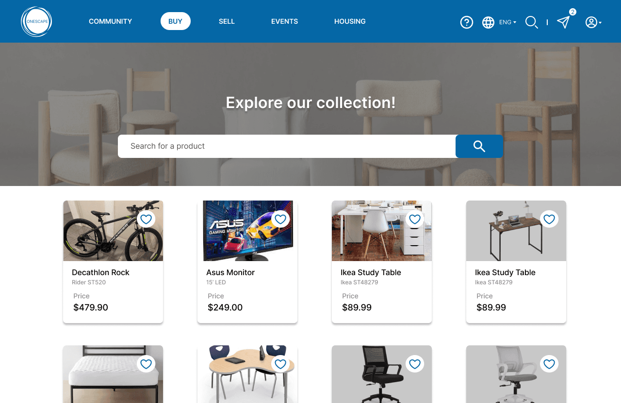
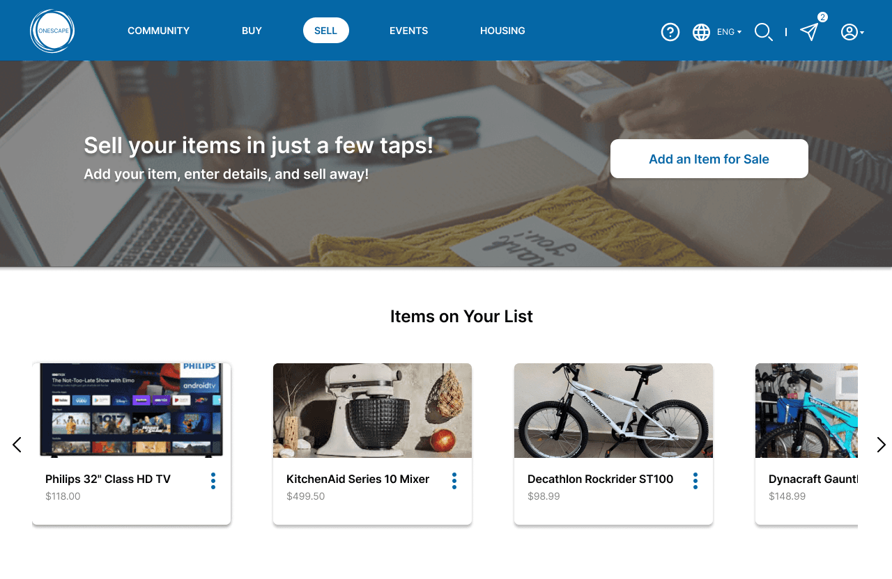
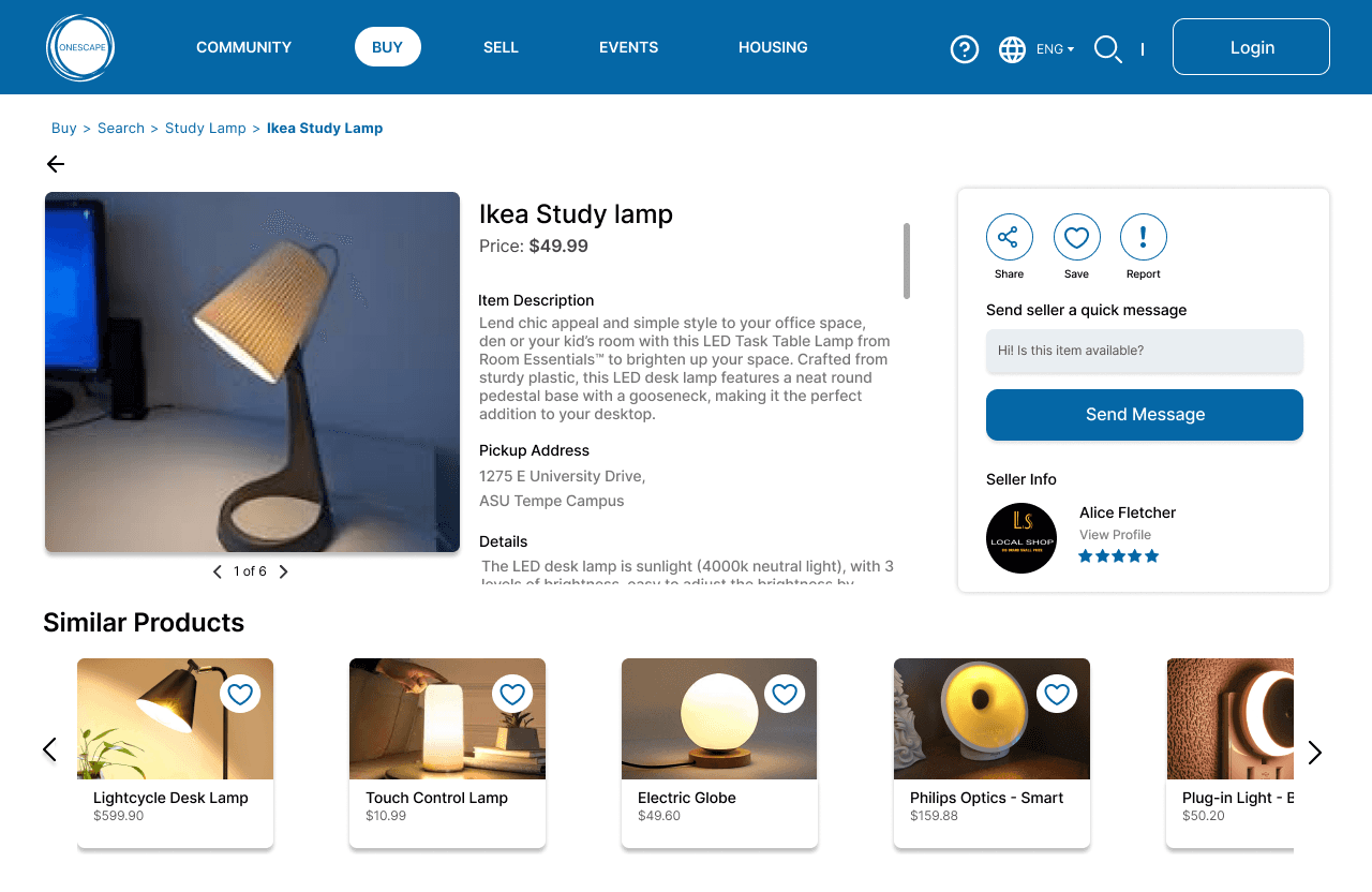
Intuitive Buy Filters
The filters were fixed to mimic the actual workings of filters as closely as possible and can now be removed in multiple ways - by clicking on the reset button, unchecking the filters, or closing them from under the search bar. The results will now change dynamically when filters are applied and removed in order.
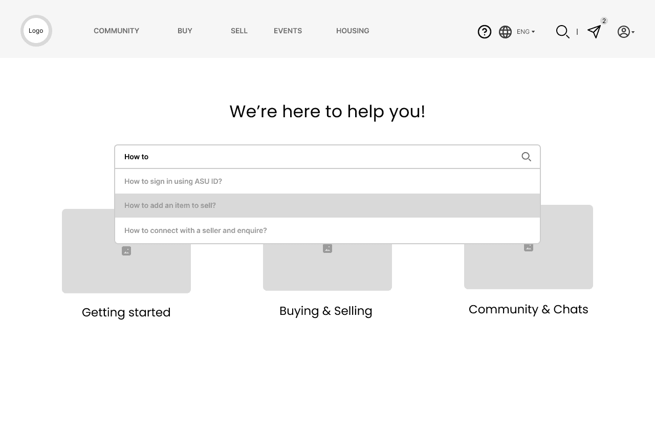
An Actionable Help Center
Even though no issues were found in the help center page, we decided to enhance it to make sure it follows the existing design patterns. We added a "Post a Query" button to make the help center page more effective and the design more consistent with other websites in general. This enables users to ask the queries they can’t find answers to freely within the help community.


Learnings & Next Steps
My first ever UX team project! This was a success in terms of capturing the essence of the product and presenting usability recommendations by the project's conclusion.
Perfecting the user-centric design approach: While designing a website, it is easy to get lost in the visual or interaction design's details. Always asking "What is the user's goal here?", and going back and forth between research data and the prototypes allowed us to stay grounded and make design decisions with the users' needs in mind.
Testing low-fidelity prototypes can be challenging: This can get really tricky really fast since users aren't really interacting with a polished product. There's bound to be some confusion, and some hard and fast rules need to be set if one wants to test something like this early in the lifecycle of the process.
Continuous research is important: Don't be afraid to take a step back and conduct more research if needed. At the end of the day, the designer is not the intended audience, so research data should always act as a reason for design changes.
The next steps would be to test the high-fidelity prototype for any issues, design the application for more screen sizes, enable more functionalities like housing and events, and conduct further research after enabling those functionalities